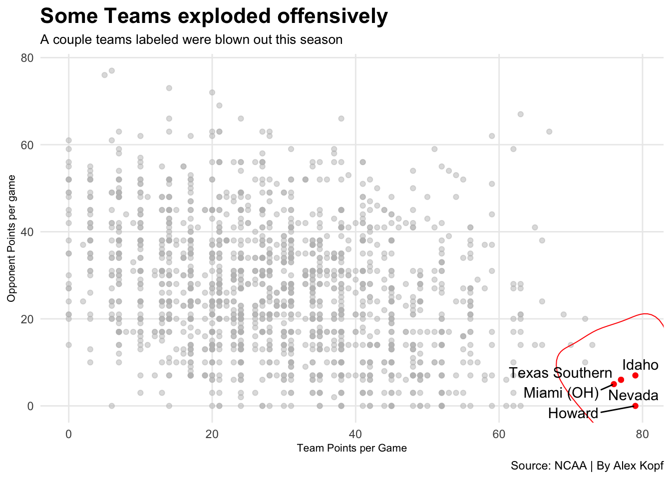
I am going to determine which games this college football season had the worst score differential
library(tidyverse)## ── Attaching packages ─────────────────────────────────────── tidyverse 1.3.0 ──## ✓ ggplot2 3.3.3 ✓ purrr 0.3.4
## ✓ tibble 3.0.3 ✓ dplyr 1.0.2
## ✓ tidyr 1.1.2 ✓ stringr 1.4.0
## ✓ readr 1.4.0 ✓ forcats 0.5.0## ── Conflicts ────────────────────────────────────────── tidyverse_conflicts() ──
## x dplyr::filter() masks stats::filter()
## x dplyr::lag() masks stats::lag()badlogs <- read.csv("badfootballlogs19.csv")I separated the columns to display whether it was a win, a loss and then the score and which team scored how many points.
badlogs <- badlogs %>% separate(Result, into=c("Outcome", "Score"), sep=" ") %>% mutate(Score = gsub(")", "", Score, fixed=TRUE)) %>% mutate(Score = gsub("(", "", Score, fixed=TRUE)) %>% separate(Score, into=c("TeamScore", "OpponentScore"), sep="-")Following mutating the data I collected, I mutated the scored to show as a numeric number rather than a character.
badlogs <- badlogs %>% mutate(TeamScore = as.numeric(TeamScore), OpponentScore = as.numeric(OpponentScore))Now that they were seen as characters, I reated a column for differential between Team Score and Opponent score to see the highest differentials of last season.
badlogs <- badlogs %>% mutate(Differential = TeamScore - OpponentScore)worstgames <- badlogs %>% filter(Differential > 65)We now found the worst games in whcih the differential was greater than 65 points.
library(ggalt)## Registered S3 methods overwritten by 'ggalt':
## method from
## grid.draw.absoluteGrob ggplot2
## grobHeight.absoluteGrob ggplot2
## grobWidth.absoluteGrob ggplot2
## grobX.absoluteGrob ggplot2
## grobY.absoluteGrob ggplot2library(ggrepel)ggplot() +
geom_point(
data=badlogs,
aes(x=TeamScore, y=OpponentScore),
color="grey",
alpha=.5) +
geom_point(
data=worstgames,
aes(x=TeamScore, y=OpponentScore),
color="red") +
geom_encircle(data=worstgames, aes(x=TeamScore, y=OpponentScore), s_shape=.15, expand=.15, colour="red") +
labs(x="Team Points per Game", y="Opponent Points per game", title="Some Teams exploded offensively",subtitle = "A couple teams labeled were blown out this season", caption="Source: NCAA | By Alex Kopf") +
theme_minimal() + theme(
plot.title = element_text(size = 16, face = "bold"),
axis.title = element_text(size = 8),
plot.subtitle = element_text(size=10),
panel.grid.minor = element_blank()
) +
geom_text_repel(data=worstgames, aes(x=TeamScore, y=OpponentScore, label=Opponent))